
About Data Visualization
College of Medicine Research Information Technology transforms data into meaningful knowledge by using cutting-edge tools and developing custom software. Building on platforms like RShiny and Tableau, RIT creates and hosts interactive dashboards. Researchers can use these dashboards to analyze large-scale data sets.
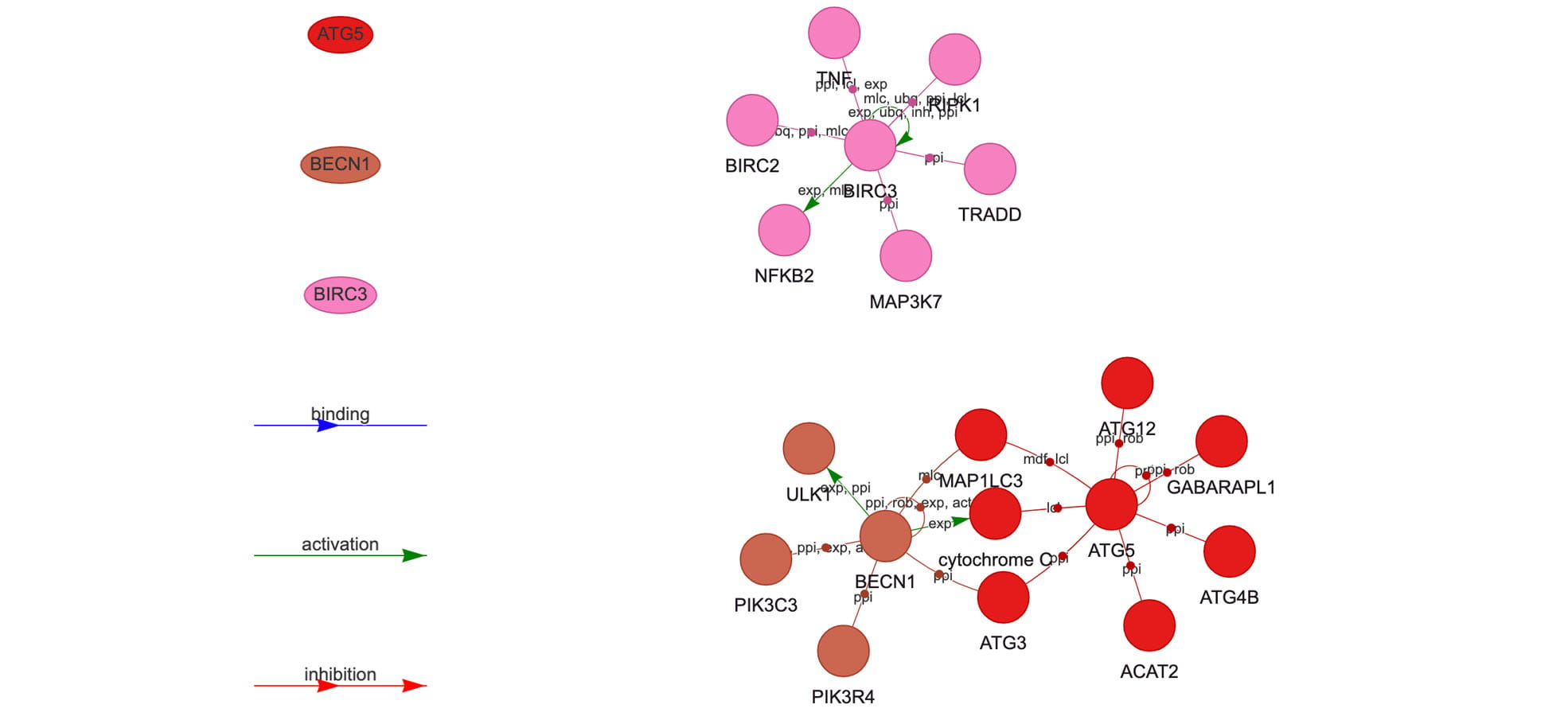
XDeathDB allows researchers to interact with cell death data in a network plot, discovering new connections between genes.
Purpose
Interactive visualizations
Dashboards facilitate rich description and modeling
Public and secured
applications
Create a tool for public use or within a research group
Data pipelines
Streamlining to reduce manual interventions
RIT's approach

Understand the data
Before beginning tool development, experts from RIT meet with researchers to learn more about the data. Over the course of one or two meetings, RIT becomes more familiar with the dataset, and can make recommendations for how to best present it in the tool.

Build the visualization
Using dataset supplied by the researcher, RIT transforms and structures the data to fit the intended visualization. Using existing software packages like RShiny or Tableau, RIT can create interactive visualizations to facilitate discovery of new relationships within the data.

Automate reporting
As data accumulates, it can be cumbersome to manually update existing visualizations and markdown reports. RIT writes code that detects new data and pulls it into the visualization environment, creating a pipeline that constantly updates visualization tools and reports.