What is ACHIEVE?
For ACHIEVE, a mobile health app targeted at improving health outcomes for mothers with pregestational diabetes, user experience experts from College of Medicine Research Information Technology used insights from user interviews and testing to create prototypes for a mobile health app and corresponding provider dashboard. Working with the PI, Dr. Naleef Fareed, RIT met with ten users and designed over a dozen screens for two prototypes, which were submitted as part of Dr. Fareed’s NIH grant proposal.

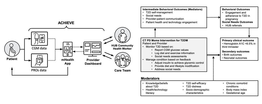
RIT designed both screens for a mobile app and a provider-facing dashboard, showing how the data flowed through the patient-facing app into the provider's view of the patient.
RIT's Approach to ACHIEVE
An app-based intervention has a much greater chance of success if participants actually want to use it, so how do we find out what participants want? For the ACHIEVE project, members of RIT developed a design by talking with expecting mothers and members of their care team about the challenges they faced.

Learning what users want
Members of RIT collaborated on an interview guide with Dr. Fareed to learn more about the challenges faced by expecting mothers and members of their care team. From the interviews, the team was able to understand the mother’s pregnancy journey, as well as the actions the care team took to support mothers. This understanding shaped how we thought about the app and provider dashboard and their place in existing workflows.

Designing what users need
At the core of Dr. Fareed’s vision for the app was to improve communications between patients and providers, so we improved on the pen-and-paper glucose logging method by creating an app design that would sync that data to a provider dashboard. The app also encouraged other healthy behaviors during pregnancy. To put together these different ideas, designers within RIT sketched different components on paper before incorporating them into a digital design. After piloting these designs with mothers and providers, we continued to tweak the design based on their responses.

Improving design by engaging users
Involving the people who would be using the app at every stage of the process ensured the final design was easy to use. To test this, we gave people a few tasks to do using the app and dashboard. Seeing how newcomers would use the app for the very first time showed us where we could improve the design. Participants in the testing process responded positively to the new prototype, even asking if the new app was something they could download right away.
Final Deliverable
From the full prototype they had created, members of RIT recommended which screens would best illustrate the app for the NIH grant proposal. Along with the screens, they summarized the usability testing to show the participants’ buy-in for the app. To accompany the prototype, RIT also illustrated the intervention’s overall workflow and timeline, giving the grant proposal a uniform look and feel.

Along with screenshots of the mobile app and provider dashboard, the grant proposal illustrated how patients and providers would use ACHIEVE over the course of the patient's pregnancy.
